Challenge: Create a totally new look for the clients logo incorporating a representation of the Washington Beltway and the ‘OUR’ of Ourisman.
Responsible for: Selecting fonts and colors. Designed a simplistic icon and a range of logos that reflect some of the client’s dealerships.
Challenge: Create a logo/icon using existing fonts, that depicts the product and how it’s used.
Responsible for: Illustration and color palette.
PART OF A TOTAL RE-BRAND
Challenge: Create a logo that is totally different to anything they had or anyone else’s within the client’s market. Ultimately they wanted to be known as ‘SR’.
Responsible for: Full design, colors and custom typography.
Challenge: Create a family of logos celebrating 50 years in business, keeping clients identity while incorporating brand fonts and colors.
Responsible for: Full design using additional typography and color.
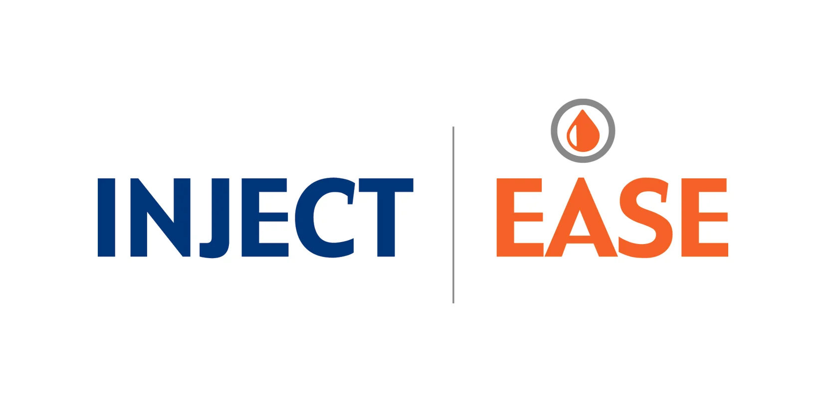
Challenge: Create a clean, versatile product logo, using brand colors. It should read as one word, but bring attention to each word individually, while expressing it’s function.
Responsible for: Complete design, illustration and typography.
Challenge: Create a graphic treatment for 2016 IBC, that included a lockup with the client’s corporate logo. Graphic should reflect Orlando, and include brand palette and fonts.
Responsible for: Entire illustration development and layout.
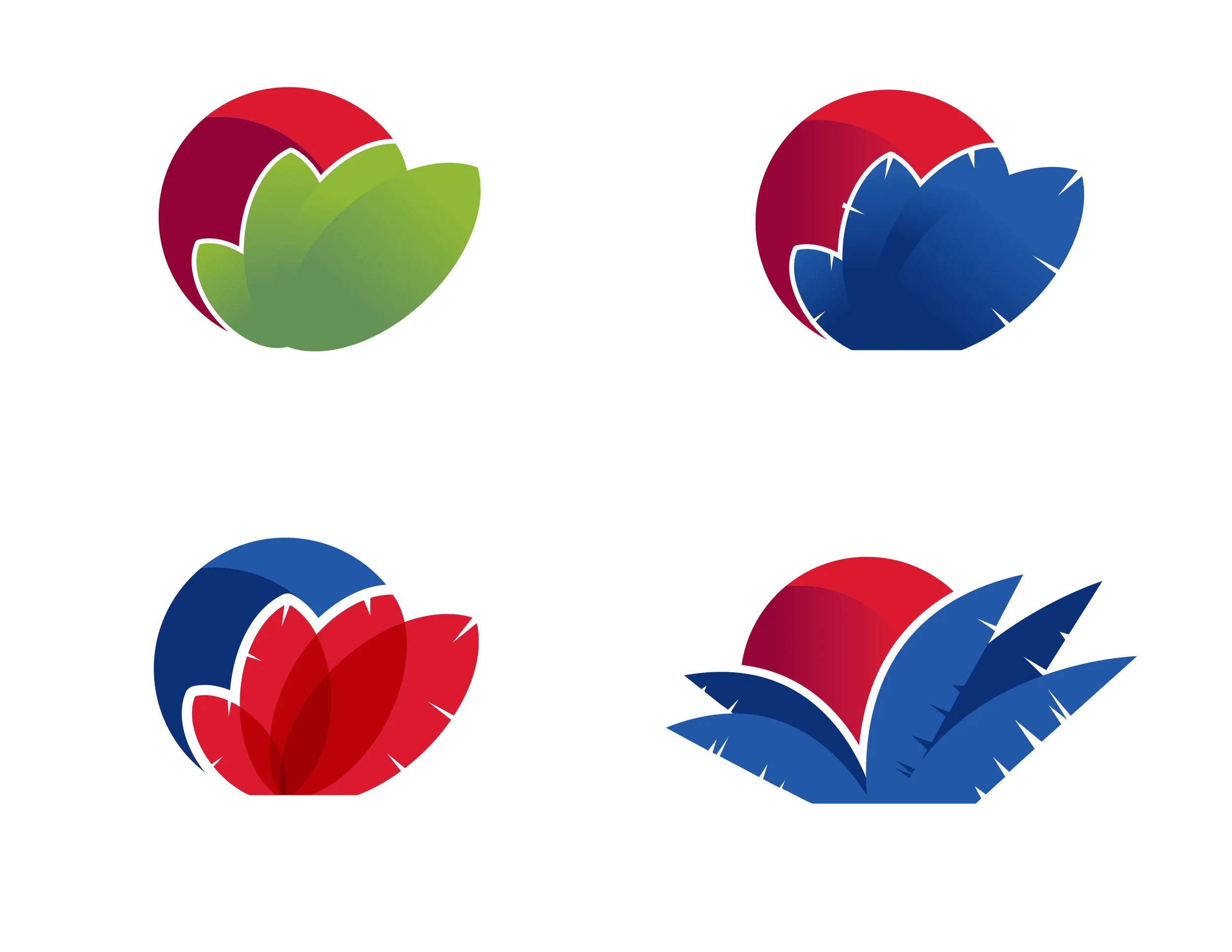
Challenge: Develop a logo that promoted ‘organic’ connotations without being too literal.
Responsible for: Complete design, typography, color palette and illustration.
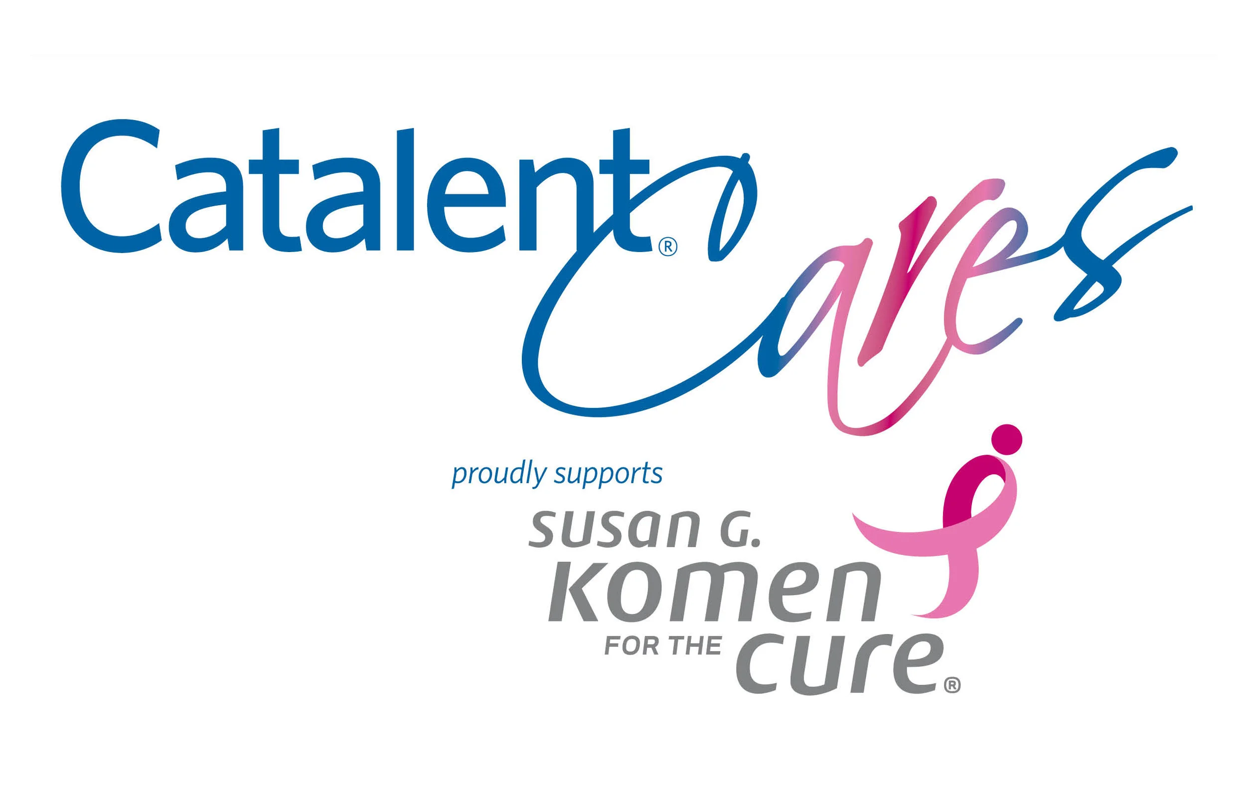
Challenge: Create a lock-up using the brand logo, colors and additional copy to compliment the Susan G. Komen logo.
Responsible for: Typography, color application and layout.
Independently created work — just for fun.